

Screen Resolution Detector
What is Screen Resolution Detector?
The Screen Resolution Detector is a powerful web-based tool that provides comprehensive information about your display configuration in real-time. This advanced tool goes beyond simple resolution detection to give you detailed insights about your screen's capabilities and characteristics.
Unlike basic detection tools, our Screen Resolution Detector analyzes multiple aspects of your display including physical resolution, pixel density (PPI), aspect ratio, color depth, and multi-monitor configurations. It works across all modern browsers without requiring any installations or permissions.
This tool is essential for web developers, designers, quality assurance teams, and hardware enthusiasts who need accurate display information for responsive design testing, compatibility verification, and hardware evaluation.
With its clean, modern interface and real-time updating capabilities, the Screen Resolution Detector provides instant, accurate, and comprehensive display analysis that helps you understand exactly what your screen can do.
How to Use Our Screen Resolution Detector
Click Detect Display
Initiate the detection process by clicking the "Detect Display" button. The tool will immediately start analyzing your screen configuration with a visual progress indicator.
Review Detailed Results
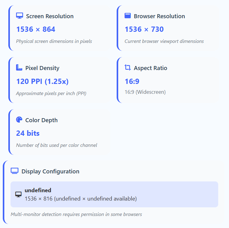
Examine the comprehensive information displayed, including screen resolution, browser viewport, pixel density, aspect ratio, and color depth. All data updates in real-time.
Multi-Monitor Analysis
If you have multiple monitors, the tool will attempt to detect and display information for each connected display. Primary monitors are highlighted for easy identification.
Resize for Testing
Resize your browser window to see how the viewport dimensions change in real-time. The tool automatically updates to show current browser resolution compared to your screen resolution.
Key Information Detected
Pro Tips for Optimal Use
- Use the tool when setting up new displays or changing display settings
- Compare screen resolution vs browser viewport for responsive design testing
- Check pixel density to optimize images for Retina/high-DPI displays
- Use the reset button to clear all information and start fresh
- The tool works best in modern browsers with full Web API support
- Resize your browser window to see real-time viewport updates
Frequently Asked Questions
Screen resolution refers to the total number of physical pixels your display can show (e.g., 1920×1080). This is fixed and represents the maximum capability of your monitor. Browser viewport is the visible area within your browser window, which can be smaller than your screen resolution due to browser chrome, toolbars, bookmarks, or window sizing. Understanding both is crucial for responsive web design and user experience optimization.
Pixel density (Pixels Per Inch) determines how sharp and detailed images and text appear on your screen. Higher PPI displays (like Retina displays or 4K monitors) show more detail but may require content scaling. Our tool helps you understand your display's PPI to optimize images, choose appropriate font sizes, and ensure crisp rendering across different devices. This is especially important for designers and developers creating high-fidelity interfaces that need to look great on all screen types.
Yes, when supported by your browser and with proper permissions, our tool can detect multiple monitors. Modern browsers that support the Screen Details API will show information for all connected displays including resolution, availability, and primary/secondary status. The primary monitor is typically highlighted for easy identification. For browsers without this API support, the tool will show information for the primary display only with a note about multi-monitor limitations.
Aspect ratio describes the proportional relationship between a screen's width and height. Common ratios include 16:9 (standard widescreen), 4:3 (traditional monitors), 21:9 (ultrawide), and 16:10 (some laptops). Understanding aspect ratio helps designers create content that fits properly without distortion, ensures consistent viewing experiences across different devices, and helps users choose appropriate media formats. Our tool calculates and displays both the exact aspect ratio and the closest common standard.
Our pixel density calculation provides a close approximation based on standard DPI values (typically 96 DPI for Windows, 72 DPI for Mac) multiplied by your device's pixel ratio. For exact PPI measurements, physical screen size information would be needed, which isn't always available through browser APIs. However, our calculation gives you a reliable estimate for most practical purposes including responsive design and image optimization. The result is accurate enough for web development and design decisions.
Color depth indicates how many colors your display can show. Higher color depths (like 24-bit or 30-bit) can display millions of colors with smooth gradients, while lower depths may show banding or color inaccuracies. Most modern displays support at least 24-bit color (16.7 million colors). Professional displays for graphic design, photo editing, and video production often support 30-bit or higher color depth for more accurate color representation. Our tool shows you exactly what your display supports.
Multi-monitor detection requires special permissions because it can reveal information about your hardware setup and potentially be used for fingerprinting. This is a privacy protection measure implemented by browsers. When you grant permission (typically through a browser prompt), you're allowing the tool to access detailed screen information that isn't available through standard APIs. Our tool only requests these permissions when necessary and never stores or transmits this information.
Absolutely! Our Screen Resolution Detector works on all modern mobile devices including smartphones and tablets. It's particularly useful for understanding the high-DPI displays common on mobile devices. The tool will show you the actual screen resolution as well as the scaled viewport dimensions used for responsive design. Mobile browsers typically have excellent support for the Screen API, making our tool highly accurate on these devices.
It's good practice to check whenever you: set up a new display, change display settings (resolution or scaling), install new graphics drivers, encounter rendering or display issues, or are testing responsive designs. Web developers and designers should check regularly across different devices to ensure their creations look great on all screen types and sizes. The tool's real-time updating makes it perfect for ongoing testing and verification.
Yes, completely! All detection and processing happens locally in your browser. No screen information is transmitted to our servers or stored anywhere. The tool works entirely client-side, ensuring your privacy and data security. We don't use cookies, tracking pixels, analytics, or any other data collection methods. Your display information remains on your device at all times and is never shared with anyone.