

Cubic Bezier Generator
Create and visualize custom CSS easing functions with this interactive tool
Control Points
Animation Controls
Bezier Curve Visualization
CSS Output
Common Presets
What is Cubic Bezier Generator?
The Cubic Bezier Generator is an advanced visual tool for creating, testing, and understanding CSS cubic-bezier easing functions. Using interactive controls and real-time visualization, this tool allows designers and developers to craft custom animation timing functions that go beyond standard easing options.
Unlike basic easing function tools, our generator offers full control over four control points (P1-X, P1-Y, P2-X, P2-Y) that define the shape of the bezier curve. These points determine how animations accelerate and decelerate, giving you complete creative control over motion dynamics in web animations, UI transitions, and interactive elements.
This professional animation tool is designed for UI/UX designers, frontend developers, motion designers, and web animators who need precise control over animation timing. Whether you're creating smooth page transitions, interactive micro-animations, complex loading sequences, or engaging user interfaces, our bezier generator provides the mathematical foundation for perfect motion design.
With its interactive curve visualization, real-time animation preview, and comprehensive preset library, the Cubic Bezier Generator transforms complex mathematical functions into intuitive visual controls, making professional-grade animation timing accessible to everyone.
How to Use Cubic Bezier Generator
Adjust Control Points
Use the four sliders to adjust the cubic-bezier control points: P1-X, P1-Y, P2-X, and P2-Y. These values range from 0 to 1 and define the shape of the easing curve. The X values control timing, while Y values control progress along the animation path.
Visualize the Curve
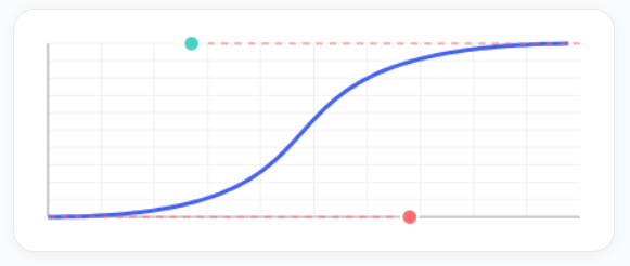
Watch the curve visualization update in real-time as you adjust the control points. The graph shows how your easing function will affect animation timing, with the X-axis representing time and the Y-axis representing animation progress.
Test the Animation
Observe the animated ball moving back and forth using your custom easing function. Use the play/pause controls to examine the animation closely, and test in fullscreen mode to see how your easing function performs in different contexts.
Export Your Function
Copy the generated cubic-bezier CSS code directly to your clipboard. Use this code in your CSS animations, transitions, or JavaScript animation libraries to apply your custom easing function to any element or animation sequence.
Key Features
Common Cubic Bezier Presets
Pro Tips for Creating Smooth Animations
- For natural-feeling animations, keep curves smooth without sharp angles or extreme values
- Use negative Y values to create bounce or overshoot effects that extend beyond the target
- For fast, snappy animations, use steeper curves with higher Y values
- For slow, elegant animations, use gentle curves with lower Y values
- The X values control timing - higher X1 means slower start, higher X2 means slower end
- The Y values control motion intensity - higher absolute values mean more dramatic motion
- For UI element transitions, test multiple easing functions to find the most intuitive feel
- Use asymmetric curves (different shapes for start and end) for more dynamic animations
- Always test animations on actual devices as performance can vary across platforms
- Consider user attention and context - different easing functions communicate different intentions
Frequently Asked Questions
A cubic-bezier function is a mathematical function that defines how an animation progresses over time. In CSS, it's used as a timing function for animations and transitions. The function takes four parameters (P1-X, P1-Y, P2-X, P2-Y) that define a bezier curve. This curve maps time (X-axis) to animation progress (Y-axis). Unlike simple keywords like "ease" or "linear", cubic-bezier gives you complete mathematical control over acceleration and deceleration patterns, allowing for custom easing effects like bounce, elastic, or custom smoothness that can't be achieved with standard easing functions.
Each control point affects different aspects of the animation: P1-X (first control point X) controls initial acceleration - lower values start slower, higher values start faster; P1-Y (first control point Y) controls initial intensity - negative values create overshoot at start, positive values create stronger initial push; P2-X (second control point X) controls deceleration timing - lower values slow down earlier, higher values maintain speed longer; P2-Y (second control point Y) controls final intensity - values above 1 create overshoot at end, below 0 create bounce-back. Together, these four points create a unique motion profile that defines exactly how an animation accelerates, maintains speed, and decelerates.
Standard easing functions (ease, ease-in, ease-out, ease-in-out, linear) are predefined cubic-bezier curves that cover common use cases. Custom cubic-bezier functions allow you to: Create unique motion beyond the five standard options; Fine-tune existing easing for specific design needs; Match platform conventions like iOS or Material Design precisely; Create personality with brand-specific animation styles; Solve specific problems like making animations feel faster without changing duration. While standard easing works for 80% of cases, custom cubic-bezier gives you the precision needed for polished, professional animations that enhance user experience rather than just moving elements.
Use custom easing functions when: Standard easing doesn't feel right for your specific animation; You need to match existing animations from design systems or other platforms; Creating signature animations that define your brand's motion language; Animating complex sequences where timing needs precise control; Creating playful interactions with bounce, elastic, or overshoot effects; Optimizing perceived performance - custom easing can make animations feel faster without actually reducing duration; Creating accessibility-focused animations with specific timing for users with motion sensitivities. For most basic transitions, standard easing is sufficient, but custom easing elevates animations from functional to exceptional.
Yes! Cubic-bezier functions can create bounce and elastic effects by using Y values outside the 0-1 range. For bounce effects: Use negative Y values to make the animation overshoot in the opposite direction before settling; For elastic effects: Use Y values greater than 1 to create overshoot beyond the target with spring-like oscillation. The tool includes presets for both effects. These advanced easing functions work by allowing the animation to temporarily exceed its target value (overshoot) or go below it (undershoot) before settling at the final position, creating the illusion of physical properties like elasticity or momentum.
Cubic-bezier functions are generally performant, but consider: Browser support is excellent (all modern browsers support cubic-bezier); Complex curves with extreme values may cause slight performance overhead compared to simple linear easing; Mobile devices may handle complex easing differently than desktop; Simultaneous animations with different easing functions can sometimes cause synchronization issues. For best performance: Avoid extremely complex curves with multiple direction changes; Test on target devices to ensure smooth animation; Use hardware acceleration (transform and opacity properties) with custom easing for best results. In practice, cubic-bezier performance impact is minimal and worth the improved user experience.
Implementation is straightforward: CSS transitions - use as the timing function: transition: all 0.3s cubic-bezier(0.25, 0.1, 0.25, 1);; CSS animations - use in animation shorthand: animation: slide 1s cubic-bezier(0.25, 0.1, 0.25, 1);; JavaScript animations - most libraries accept cubic-bezier strings directly; Sass/SCSS variables - store as a variable for consistent usage; Design systems - include in motion tokens or design tokens. The generated code is directly copy-pasteable into any CSS context. For JavaScript frameworks like React, you can use the cubic-bezier string in inline styles or CSS-in-JS solutions.
Cubic-bezier curves are based on Bernstein polynomials and are defined by four points: P0 (0,0), P1 (x1,y1), P2 (x2,y2), and P3 (1,1). The curve is calculated using the formula: B(t) = (1-t)³P0 + 3(1-t)²tP1 + 3(1-t)t²P2 + t³P3 where t ranges from 0 to 1. This creates a smooth curve that starts at P0 (0% progress, 0% time) and ends at P3 (100% progress, 100% time), with P1 and P2 acting as control points that influence the curve's shape without being on the curve itself. The cubic nature (third-degree polynomial) allows for one inflection point, making it ideal for animation timing where you need control over acceleration and deceleration patterns.
While the tool doesn't have built-in saving functionality, you can: Copy the CSS code and save it in your project files; Take screenshots of the curve visualization for documentation; Bookmark specific configurations by saving the tool with particular slider values (though this is browser-dependent); Export as design tokens for use in design systems; Share the four values (x1,y1,x2,y2) with team members who can input them into their own instance of the tool. For persistent storage, we recommend adding your favorite cubic-bezier functions to your project's design system documentation or style guide for consistent usage across your team.
Our web-based tool offers specific advantages: Accessibility - works in any browser without software installation; Real-time CSS output - generates immediately usable code; Animation preview - shows exactly how the easing will look in practice; Focus on animation timing - specialized for easing functions rather than general bezier curves; Cost - completely free vs. expensive design software. Compared to design software: Ease of use is better for this specific task; Learning curve is minimal; Integration with web workflow is seamless. While design software may offer bezier tools, they're typically designed for drawing rather than animation timing, making our specialized tool more effective for creating CSS easing functions.