
CSS Border Radius Pro
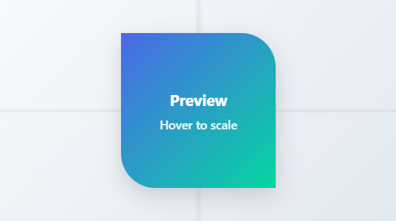
Create perfect rounded corners with our advanced CSS border radius generator
What is CSS Border Radius Generator?
The CSS Border Radius Generator is a sophisticated web-based tool designed to create and visualize rounded corners for HTML elements with precision and ease. This powerful utility provides complete control over all four corners of an element, allowing for symmetrical, asymmetrical, and creative border radius configurations through an intuitive visual interface.
Unlike basic CSS tools, our generator offers individual corner control, multiple unit support, and real-time CSS code generation. It enables designers and developers to experiment with different radius values, preview changes instantly, and generate production-ready CSS code that can be directly implemented in web projects.
This essential tool is built for web designers, UI/UX developers, frontend engineers, and anyone working with modern web interfaces. Whether you're designing buttons, cards, modals, avatars, or custom interface elements, our Border Radius Generator provides the flexibility and precision needed to create polished, professional designs.
With its live preview, preset configurations, unit flexibility, and multiple copy options, the CSS Border Radius Generator transforms complex border styling into a simple, efficient workflow that enhances both design creativity and development productivity.
How to Use CSS Border Radius Generator
Adjust Corner Values
Use the sliders or direct number inputs to set values for each corner: top-left, top-right, bottom-right, and bottom-left. Enable "Sync all corners" to change all values simultaneously, or adjust corners individually for asymmetric designs.
Select Units and Preview
Choose between pixel (px), percentage (%), em, or rem units for each corner. Percentage values create elliptical corners relative to element dimensions. Watch the live preview update in real-time as you make adjustments.
Apply Quick Presets
Use the preset buttons for common configurations: square corners, slight rounding, pill shapes, perfect circles, or various asymmetric patterns. Presets provide instant access to popular design patterns without manual adjustments.
Copy Generated CSS
Copy the generated CSS code in shorthand format (border-radius: ...) or individual corner properties (border-top-left-radius: ...). Use the code directly in your stylesheets or as a learning reference for CSS border radius syntax.
Key Features
Pro Tips for Effective Border Radius Usage
- For consistent design systems, establish standard border radius values (e.g., 4px, 8px, 12px, 16px) and use them consistently across components
- Use percentage values (%) for circles and ellipses, especially with square elements where 50% creates perfect circles
- Consider accessibility guidelines - some users may prefer more rounded corners for better visual focus and contrast
- For modern UI designs, combine subtle border radius (4-8px) with shadows and gradients for depth
- When using asymmetric border radius, ensure visual balance by complementing rounded corners with straight edges
- Test border radius on hover states to create interactive elements that respond to user interaction
- For responsive designs, use relative units (em, rem, %) or CSS variables for consistent scaling across breakpoints
- Combine border radius with overflow: hidden to create custom-shaped containers for images and content
- Use CSS transitions to animate border radius changes for smooth, engaging user interactions
- Always test across browsers as border radius rendering can vary slightly between different browser engines
Frequently Asked Questions
Pixel units (px) and percentage units (%) create different types of rounded corners: px units create circular corners with fixed radius, independent of element size. % units create elliptical corners where the radius is calculated as a percentage of the element's dimensions. Key differences: Circle creation - 50% creates perfect circles on square elements; Responsiveness - % values scale with element size, px values remain fixed; Elliptical shapes - % values can create non-uniform curves; Consistency - px values maintain exact radius across elements. For responsive designs, % or relative units (em/rem) often work better, while px provides precise control for fixed designs.
To create a perfect circle with CSS border radius: Square element - width and height must be equal; 50% radius - use border-radius: 50%; Alternative approach - border-radius: 50px (if element is 100px × 100px). In our tool: Use the "Circle" preset - applies 50% to all corners; Ensure square preview - the preview box is already square; Verify dimensions - for implementation, ensure your element has equal width and height; Consider overflow - content may extend beyond circular bounds; Browser support - perfect circles work in all modern browsers. Remember: Circles only work perfectly on square elements - on rectangular elements, 50% creates ellipses instead.
Border radius performance is generally excellent in modern browsers: Hardware acceleration - most browsers use GPU acceleration for border radius rendering; Minimal impact - border radius has negligible performance impact on modern devices; Considerations - extremely complex shapes or animations may affect performance; Mobile devices - test on target mobile devices for smooth rendering. For optimal performance: Use simple values - avoid extremely complex or irregular border radius combinations; Limit animations - animating border radius can be performance intensive; Browser testing - some older browsers may have performance issues; Combine with other properties - border radius typically performs well with shadows and gradients. In practice, border radius is highly optimized and rarely causes performance issues.
Absolutely! Border radius combines beautifully with many CSS properties: Box shadows - rounded corners with shadows create depth and dimension; Gradients - radial or linear gradients within rounded elements; Borders - rounded corners work with all border styles (solid, dashed, dotted); Transforms - scale, rotate, or translate rounded elements; Transitions/animations - animate border radius changes; Overflow: hidden - clip content to rounded boundaries; Background properties - background-size, background-position within rounded containers; Filter effects - blur, brightness, contrast on rounded elements. Our tool focuses specifically on border radius, but the generated CSS integrates seamlessly with other properties in your stylesheets.
Shorthand syntax (border-radius) and individual properties offer different approaches: Shorthand - border-radius: top-left top-right bottom-right bottom-left; Individual properties - border-top-left-radius, border-top-right-radius, etc. Key differences: Syntax brevity - shorthand is more concise; Specificity control - individual properties allow targeted overrides; Maintainability - individual properties can be clearer in complex codebases; Browser support - both have excellent support. Our tool provides both options: Shorthand for efficiency - when all corners are defined together; Individual for precision - when you need separate control or documentation. In most cases, shorthand is preferred for its brevity and clarity.
Border radius affects both element background and content: Background images - clipped to rounded corners; Regular images (img tags) - clipped to rounded corners; Child elements - may extend beyond rounded corners unless overflow: hidden is set; Background properties - background-size, background-position work within rounded boundaries. Important considerations: Overflow control - use overflow: hidden to strictly contain content; Image quality - high-resolution images may show artifacts at rounded edges; Transparency - PNG images with transparency work well with rounded corners; SVG images - scale perfectly with rounded corners. Our preview demonstrates how border radius affects both solid backgrounds and would affect images similarly.
Border radius has excellent browser support but consider these points: Modern browsers - Chrome 4+, Firefox 4+, Safari 5+, Edge 12+, Opera 10.5+; Mobile browsers - iOS Safari 4.2+, Android Browser 2.1+; Internet Explorer - IE9+ with full support; Global coverage - approximately 98% of users worldwide. Potential issues: Rendering differences - subtle variations in anti-aliasing between browsers; Performance - older browsers may have performance issues with complex radii; Prefix requirements - no vendor prefixes needed for modern use; Testing recommendation - always test in your target browsers. The CSS generated by our tool uses standard syntax compatible with all supporting browsers.
Asymmetric border radius enables creative design possibilities: Speech bubbles - rounded corners on specific sides for conversation UI; Notched elements - straight edges with single rounded corners for visual interest; Directional flow - rounded corners that guide eye movement through interfaces; Organic shapes - irregular rounding for natural, non-geometric designs; Brand personality - unique corner treatments as brand identifiers; Visual hierarchy - varying corner radii to distinguish element importance; Interactive states - different rounding on hover/focus states; Progressive disclosure - rounded corners that reveal more as users interact. Our tool's individual corner controls and preset patterns provide a foundation for exploring these creative applications.
Animating border radius creates engaging UI interactions: CSS transitions - transition: border-radius 0.3s ease; CSS animations - @keyframes for complex radius changes; Hover effects - subtle rounding on interactive elements; State changes - different rounding for active, focus, disabled states; Loading indicators - pulsing or morphing rounded shapes; Morphing shapes - transforming between different radius configurations. Performance considerations: Hardware acceleration - modern browsers handle these animations well; Frame rate - ensure smooth 60fps animation; Mobile testing - verify performance on target devices; Progressive enhancement - animations as enhancement, not requirement. Our tool helps you discover radius values that work well for animation by providing instant visual feedback.
Yes! The generated CSS is production-ready with these qualities: Standard syntax - uses official CSS border-radius properties; Cross-browser compatibility - works in all modern browsers; Clean output - well-formatted, commented code when needed; Multiple formats - both shorthand and individual property versions; Unit flexibility - supports px, %, em, rem for responsive designs; No dependencies - pure CSS that integrates with any framework. The code is designed to be: Directly copyable - paste into your stylesheets immediately; Framework compatible - works with React, Vue, Angular, etc.; Build tool ready - compatible with Sass, Less, PostCSS; Maintainable - clear structure for easy updates. Our tool generates code that follows CSS best practices for professional web development.