

CSS Grid Generator
Create responsive CSS grid layouts instantly
Grid Preview
Generated CSS
Ready2
3
4
5
6
7
8
9
10
11
12
What is CSS Grid Generator?
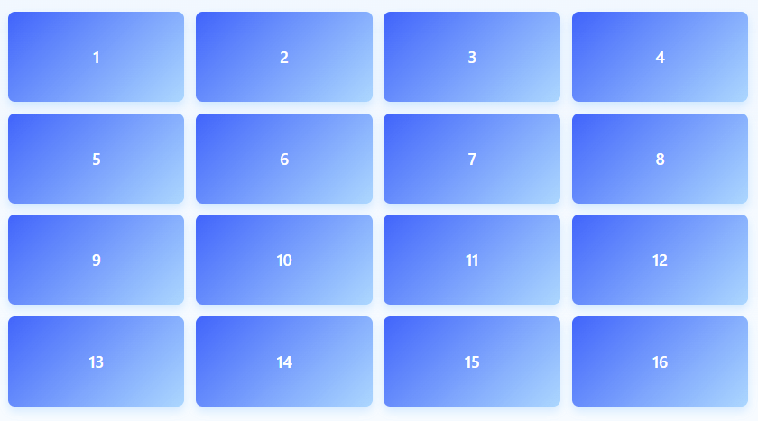
The CSS Grid Generator is a powerful visual tool that helps designers and developers create responsive grid layouts for modern web design without writing complex CSS code. Using an intuitive interface and real-time preview, this tool generates clean, production-ready CSS Grid code that you can directly implement in your projects.
Unlike basic layout tools, our generator offers complete control over grid properties including rows, columns, gaps, spacing, and item dimensions. It provides visual feedback for every adjustment, making it easy to understand how CSS Grid properties affect your layout in real-time.
This essential layout tool is designed for frontend developers, UI/UX designers, web designers, and anyone working with responsive web layouts. Whether you're building complex dashboards, photo galleries, product grids, or responsive page layouts, our CSS Grid Generator provides the foundation for creating flexible, maintainable grid systems.
With its instant code generation, visual preview, and export capabilities, the CSS Grid Generator bridges the gap between design and development, allowing you to create sophisticated grid layouts in minutes rather than hours, while ensuring your code follows modern CSS Grid best practices.
How to Use CSS Grid Generator
Configure Grid Structure
Set the number of rows and columns for your grid layout. The tool supports up to 12 rows and 12 columns, which covers most common layout requirements. You can adjust these values to create simple or complex grid structures.
Adjust Spacing & Gaps
Fine-tune the spacing between grid items using row gap and column gap controls. These values create consistent spacing between grid items, eliminating the need for margin hacks and ensuring pixel-perfect alignment.
Customize Appearance
Set container padding and item minimum height to match your design requirements. The container padding creates space around the entire grid, while item minimum height ensures consistent sizing for all grid items.
Generate & Export Code
Copy the generated CSS code directly to your clipboard, download it as a CSS file, or use the built-in preview to test your grid layout. The code includes all necessary CSS Grid properties with clear comments for easy integration.
Key Features
Common CSS Grid Layout Examples
grid-template-columns: repeat(3, 1fr);
grid-template-rows: repeat(3, 1fr);
grid-template-columns: repeat(auto-fit, minmax(200px, 1fr));
gap: 20px;
grid-template-columns: 250px 1fr;
grid-template-rows: 60px 1fr;
grid-template-columns: repeat(4, 1fr);
gap: 15px;
Pro Tips for Effective Grid Layouts
- Use fr units (fractional units) for flexible columns that adapt to container width
- For responsive designs, combine CSS Grid with media queries for different screen sizes
- The gap property is more efficient than margins for spacing grid items
- For complex layouts, use grid-template-areas for visual layout planning
- Set min-height on grid items to prevent content from breaking the layout
- Use auto-fit or auto-fill with minmax() for responsive column counts
- For nested grids, create child elements with display: grid inside grid items
- The align-items and justify-items properties control item alignment within grid cells
- For overlapping elements, use grid-column and grid-row with line numbers
- Always test grid layouts at different screen sizes and with varying content amounts
Frequently Asked Questions
CSS Grid is a two-dimensional layout system for the web that allows you to create complex layouts with rows and columns. Unlike Flexbox (which is one-dimensional), CSS Grid gives you control over both dimensions simultaneously. You should use CSS Grid for: Complex layouts requiring both row and column control; Responsive designs that need to adapt to different screen sizes; Grid-based interfaces like dashboards, galleries, and card layouts; Alignment challenges where items need precise placement; Modern web applications requiring sophisticated layout capabilities. CSS Grid is supported by all modern browsers and provides more layout power with less code compared to traditional methods.
CSS Grid and Flexbox are complementary layout systems: CSS Grid is two-dimensional (rows and columns), while Flexbox is one-dimensional (either row OR column). Use CSS Grid when: You need both row and column control; Creating overall page layouts; Working with grid-based designs. Use Flexbox when: Aligning items in a single row or column; Creating navigation bars or lists; Distributing space within a container. Many modern layouts use both: CSS Grid for the overall structure and Flexbox for alignment within grid items. The choice depends on your specific layout requirements.
Yes! The generated CSS Grid layouts are inherently responsive, but you can enhance them: Use fr units - columns sized with fr units automatically adjust to container width; Add media queries - modify grid properties at different breakpoints; Use auto-fit/auto-fill - create responsive column counts; Combine with minmax() - set minimum and maximum column sizes. The tool generates code that serves as an excellent starting point for responsive designs. For advanced responsiveness, you can extend the generated code with additional CSS media queries to adapt the grid structure for mobile, tablet, and desktop views.
CSS Grid has excellent browser support: Modern browsers - Chrome 57+, Firefox 52+, Safari 10.1+, Edge 16+; Mobile browsers - iOS Safari 10.3+, Android Chrome 57+; Global support - Approximately 95% of users worldwide. For older browsers: Use feature queries (@supports) to provide fallbacks; Consider polyfills for critical layouts; Provide simpler layouts for non-supporting browsers. The generated code uses standard CSS Grid syntax that works in all supporting browsers. For production use, always test in your target browsers and consider progressive enhancement strategies.
Individual grid items can be customized using these CSS Grid properties: grid-column - control which columns an item spans (e.g., grid-column: 1 / 3); grid-row - control which rows an item spans; grid-area - assign items to named grid areas; align-self - vertical alignment within grid cell; justify-self - horizontal alignment within grid cell; order - control visual order independent of HTML order. The generated code provides a basic .grid-item class that you can extend with additional classes or inline styles for item-specific customization. For complex layouts, consider using named grid areas for clearer organization.
Yes, the generated CSS code is production-ready with: Clean syntax following modern CSS standards; Helpful comments explaining each property; Proper formatting for readability and maintainability; Standard CSS Grid properties without vendor prefixes (not needed for CSS Grid); Responsive-friendly units like fr and percentages; Best practice implementation of grid properties. The code is designed to be: Easily integratable into existing projects; Extensible with additional styles; Maintainable with clear structure. You can directly copy and paste the generated code into your stylesheets or use it as a foundation for more complex grid systems.
Absolutely! CSS Grid excels at asymmetric layouts: Varying column widths - use different values for grid-template-columns (e.g., 1fr 2fr 1fr); Irregular row heights - specify different heights in grid-template-rows; Overlapping items - use grid-column and grid-row with overlapping values; Named grid areas - create complex layouts with grid-template-areas; Mixing fixed and flexible sizes - combine px, fr, and % units. The generator provides symmetric grids by default, but you can easily modify the generated code to create asymmetric layouts by adjusting the grid-template-columns and grid-template-rows values or adding item-specific positioning.
Content overflow in grid items can be managed with: Minimum heights - set min-height on grid items to prevent collapse; Overflow properties - use overflow: auto or overflow: hidden as needed; Content alignment - use align-items: stretch (default) or other values; Grid auto flow - control how new items are placed with grid-auto-flow; Dynamic sizing - use minmax() for flexible size constraints. The generator includes min-height for grid items, which helps prevent content from breaking the layout. For specific overflow scenarios, you may need to add additional CSS for scrollbars, text truncation, or responsive content adjustments.
CSS Grid is generally performant, but consider: Complex grid definitions - very large grids (50+ items) may impact performance; Nested grids - deeply nested grid containers add complexity; Dynamic content - frequent grid recalculations can affect performance; Mobile devices - test performance on target devices. For optimal performance: Keep grids reasonably sized for their purpose; Avoid unnecessary nesting where possible; Use simple grid definitions when complex ones aren't needed; Test on target devices to ensure smooth performance. In practice, CSS Grid performance is excellent for typical web layouts and only becomes a concern with extremely complex or dynamic grids.
To master CSS Grid: Official documentation - MDN Web Docs CSS Grid guide; Interactive tutorials - CSS Grid Garden, Grid by Example; Video courses - Wes Bos' CSS Grid course, free on YouTube; Practice projects - recreate layouts from dribbble or design inspirations; Community resources - CSS-Tricks, Smashing Magazine articles; Browser DevTools - use grid inspection tools in Chrome/Firefox; Real-world experimentation - implement grids in actual projects. The generator is a great starting point, but exploring advanced concepts like grid-template-areas, grid-auto-flow, and subgrid will help you create even more sophisticated layouts.