

Professional Color Palette Generator
Selected Color
Saved Colors
What is Professional Color Palette Generator?
The Professional Color Palette Generator is an advanced web-based tool designed to help designers and developers create harmonious color schemes using proven color theory principles. This powerful utility generates complementary, analogous, and monochromatic color palettes from any base color, providing complete control over color relationships and accessibility compliance.
Unlike basic color pickers, our generator offers scientific color theory implementations, accessibility testing, and multiple export formats. It calculates luminance, contrast ratios, and WCAG compliance automatically, ensuring your color choices work well for all users, including those with visual impairments.
This essential tool is built for UI/UX designers, web developers, graphic designers, brand strategists, and anyone working with color systems. Whether you're creating brand guidelines, designing user interfaces, developing websites, or planning marketing materials, our Color Palette Generator provides the scientific foundation and practical tools needed for professional color work.
With its real-time preview, color theory modes, accessibility validation, and multiple export options, the Professional Color Palette Generator transforms complex color theory into an accessible, efficient workflow that enhances both creativity and technical precision in color selection.
How to Use Professional Color Palette Generator
Select Your Base Color
Choose your starting color using the color picker or by entering a HEX value. This base color serves as the foundation for all generated palettes. The tool immediately calculates luminance, contrast ratios, and provides multiple color format representations.
Choose Color Theory Mode
Select from five color theory modes: Shades (monochromatic), Tints (lightened colors), Tones (grayed colors), Complementary (opposite colors), and Analogous (adjacent colors). Each mode applies different color theory principles to generate harmonious palettes.
Adjust Palette Parameters
Fine-tune your palette using the adjustment step slider (controls color variation intensity) and steps each side control (determines how many color variations to generate). Watch the palette update in real-time as you make adjustments.
Save, Copy, and Export
Save individual colors to your local storage, copy color values (HEX, RGB, HSL) to clipboard, or export entire palettes as JSON files. The tool provides contrast ratio calculations and WCAG accessibility validation for each generated color.
Key Features
Color Theory Modes Explained
Pro Tips for Professional Color Usage
- For accessible designs, ensure text colors have contrast ratios of at least 4.5:1 against their backgrounds (WCAG AA standard)
- Use HSL color format when adjusting colors programmatically - it's more intuitive for manipulating hue, saturation, and lightness
- Create color hierarchies by using darker shades for important elements and lighter tints for backgrounds
- For brand consistency, limit your palette to 3-5 main colors plus their variations for a cohesive visual identity
- Consider color psychology - different colors evoke different emotions and associations in users
- Test color palettes in grayscale to ensure proper contrast and visual hierarchy without relying on color alone
- Use complementary colors sparingly - they create strong contrast but can be visually overwhelming in large amounts
- For international audiences, research cultural color associations to avoid unintended meanings
- Create CSS custom properties (variables) from your generated palette for consistent implementation across projects
- Always test color choices on different devices and lighting conditions to ensure consistent appearance
Frequently Asked Questions
Shades mode creates darker variations of your base color by adding black. Use for: Depth and shadow in UI elements; Monochromatic designs requiring subtle variations; Visual hierarchy through darkness levels. Tints mode creates lighter variations by adding white. Use for: Background colors and subtle highlights; Light-themed interfaces and minimal designs; Progressive disclosure through lightness. Tones mode adds gray for muted variations. Use for: Professional, sophisticated palettes; Desaturated designs that need subtlety. Complementary mode finds opposite colors. Use for: High-contrast elements like CTAs; Visual emphasis and attention direction. Analogous mode creates adjacent colors. Use for: Harmonious, cohesive designs; Low-contrast interfaces needing subtle variation.
The tool calculates contrast ratios using the WCAG 2.1 formula: (L1 + 0.05) / (L2 + 0.05) where L1 and L2 are relative luminances of the colors. Relative luminance is calculated considering human perception of color brightness. Accessibility compliance is based on: WCAG AA standard - minimum 4.5:1 for normal text, 3:1 for large text; WCAG AAA standard - minimum 7:1 for normal text, 4.5:1 for large text. The tool automatically: Calculates luminance for each generated color; Compares against white/black for readability assessment; Flags compliance issues with visual indicators; Provides recommendations for improving accessibility. These calculations help ensure your color choices work for users with visual impairments including color blindness.
HEX format (#RRGGBB) represents colors as hexadecimal values. Best for: Web development and CSS usage; Compact storage in codebases; Quick copying between design tools. RGB format (rgb(R,G,B)) represents colors as red, green, and blue values 0-255. Best for: Screen display calculations; Programmatic manipulation in JavaScript; Understanding additive color mixing. HSL format (hsl(H,S%,L%)) represents colors as hue, saturation, and lightness. Best for: Color theory work and palette generation; Creating variations (adjust hue for different colors, saturation for intensity, lightness for brightness); Human understanding of color relationships. Our tool provides all three formats because each has advantages for different use cases in the design and development workflow.
The exported JSON palette can be integrated into projects in several ways: CSS Custom Properties - convert to CSS variables for consistent theming; Design Systems - use as a foundation for component libraries; Development Workflows - import into JavaScript/TypeScript projects; Documentation - include in style guides and brand manuals. The JSON structure includes: Color mode information - which theory was used; Color values array - all generated colors in HEX format; Metadata - creation timestamp and base color; Accessibility data - contrast ratios and compliance status. You can parse this JSON to: Generate CSS/Sass/Less variables; Create design tokens for cross-platform consistency; Automate color testing in CI/CD pipelines; Sync between design and development workflows.
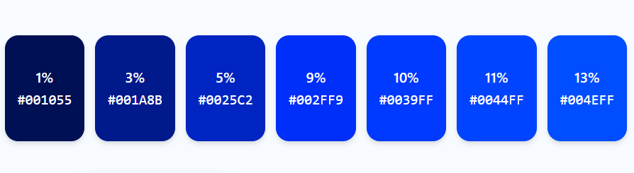
Luminance percentage represents how bright a color appears to the human eye, accounting for: Human perception - our eyes are more sensitive to green than red or blue; Color science - different wavelengths contribute differently to perceived brightness; Accessibility considerations - luminance affects readability and contrast. The tool calculates luminance using the WCAG formula: L = 0.2126 × R + 0.7152 × G + 0.0722 × B (where R, G, B are normalized to 0-1). This matters because: Readability - text needs sufficient luminance difference from background; Visual hierarchy - brighter elements attract more attention; Color blindness - luminance differences remain visible when hue perception is impaired; Print considerations - luminance affects how colors translate to grayscale. Our tool displays luminance percentages to help you make informed decisions about color usage.
Absolutely! This tool is ideal for brand color palette creation with these features: Color theory foundation - ensures harmonious relationships between brand colors; Accessibility compliance - guarantees brand colors work for all audiences; Variation generation - creates tints, shades, and tones for different use cases; Export capabilities - produces JSON for implementation across platforms. For brand work: Start with brand primary color as your base; Generate complementary colors for accents and CTAs; Create tonal variations for different contexts (digital, print, merchandise); Test accessibility for all brand applications; Export complete system for consistent implementation. The tool helps ensure your brand colors are both aesthetically pleasing and functionally effective across all applications.
The tool uses browser local storage to persist saved colors: Storage mechanism - colors are saved as a JSON array in your browser's localStorage; Browser-specific - saved colors remain within the specific browser you use; No expiration - colors persist until you clear them or clear browser data; Privacy focused - data stays on your device, not sent to servers. This enables: Cross-session persistence - colors remain available between browser sessions; Quick access to frequently used colors; Palette building over time across different projects; Reference library of proven color combinations. To manage saved colors: Add colors with the Save Current Color button; Remove individually by clearing from storage; Clear all with the Clear Saved button; Export for backup using browser developer tools if needed.
The tool references WCAG (Web Content Accessibility Guidelines) 2.1 standards: Success Criterion 1.4.3 - Contrast (Minimum): Text and images of text must have contrast ratio of at least 4.5:1 (AA) or 7:1 (AAA); Success Criterion 1.4.6 - Contrast (Enhanced): Large-scale text (18pt+ or 14pt+bold) must have contrast ratio of at least 3:1 (AA) or 4.5:1 (AAA); Success Criterion 1.4.11 - Non-text Contrast: UI components and graphical objects must have contrast ratio of at least 3:1 against adjacent colors. The tool helps you achieve: AA compliance - minimum standard for most websites; AAA compliance - enhanced standard for maximum accessibility; Non-text compliance - for buttons, icons, and other UI elements; Future-proofing - upcoming WCAG 3.0 standards will build on these foundations. Accessibility isn't just legal compliance - it's good design that serves all users.
While this tool generates universal color palettes, you can adapt them for specific design systems: Material Design - use primary color as base, generate shades for elevation levels, ensure sufficient contrast for accessibility; Apple Human Interface - focus on subtle, desaturated palettes (use Tones mode), ensure colors work in light and dark modes; IBM Carbon - generate accessible palettes with clear contrast hierarchy, export as design tokens. The tool provides: Scientific foundation for any design system; Accessibility validation required by all major systems; Export flexibility for integration into system documentation; Variation control needed for consistent theming. For system-specific requirements, use the generated palette as a starting point, then refine based on your chosen system's specific guidelines and component needs.
The tool's color calculations are highly accurate for digital color representation: Color space - uses standard sRGB color space for web colors; Luminance calculation - follows WCAG 2.1 specification precisely; Contrast ratios - calculated using the official formula; Color conversions - HEX/RGB/HSL conversions use standard algorithms. Limitations to consider: Device variation - colors appear differently on different screens due to calibration, technology, and settings; Environmental factors - lighting conditions affect color perception; Color blindness simulation - the tool doesn't simulate how colors appear to users with color vision deficiencies; Print colors - screen colors (RGB) don't always match print colors (CMYK). For maximum accuracy: Test on target devices; Use color calibration tools for critical color work; Consider user environments in your design decisions; Validate with real users whenever possible.